How did GM help sell the utopian, technology-ridden “world of tomorrow” in the 1960s? What can the boxes of rejected applications at Ulm School of Design tell us about post-war Germany’s exclusionary practices?
These questions and more were explored at the Design History Society’s “Displaying Design Conference: History, Criticism and Curatorial Discourse” that I attended in Matosinhos, Portugal.
By Melissa Delzio
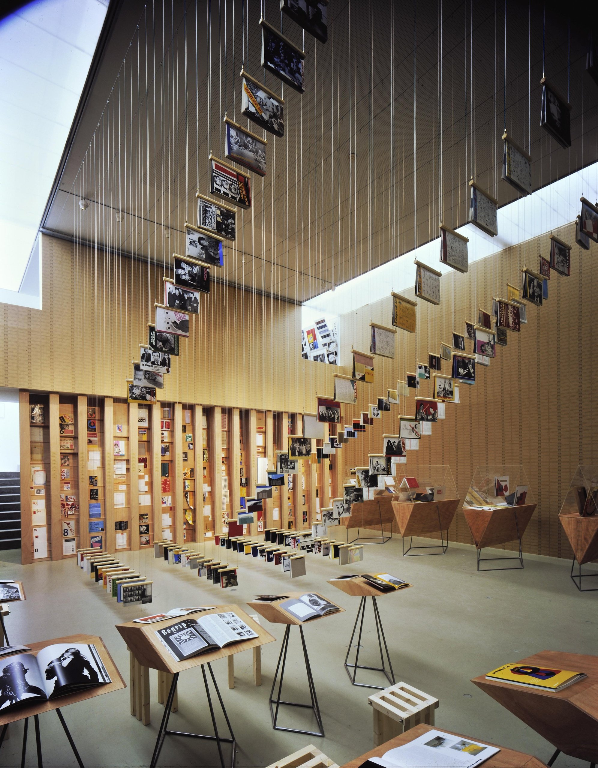
It’s 1993 in Utrecht, Netherlands, and members of a leftist design collective Wild Plakken, known for posting illegal bills, are faced with the daunting task of how to display their two decades of posters, magazines and ephemera in a retrospective exhibit. The goals of the Wild Plakken (translated as ‘wild pasting’) exhibition were to provoke discussion and share their ideological views. They feared following traditional museum display tactics would surely be the death of the work: fragmented and untouchable. Spiraling platforms are proposed with ladders and suspension wires among other novel ideas. In the end, the curators kept the viewer’s feet planted on the ground, but string the work up, shooting wire across the exhibition room and attaching magazines to lines like fresh laundry. Unsorted boxes of loose materials invited the guests to tactilely explore and play a role in sorting a display.
“The museum presentation is taboo. It kills the work,” historian Alex J. Todd declares, quoting Wild Plakken, from a university design classroom in Portugal in 2023. I scribble this quote after cracking the binding on a fresh, red, travel-sized Moleskin. This is an ironic quote to open up a conference dedicated to analyzing the design of display.
I had the honor of attending UK-based Design History Society’s, “Displaying Design Conference: History, Criticism and Curatorial Discourse” in Matosinhos, Portugal. The conference went beyond their stated mission and served up fresh ideas of how design can ignite utopian visions, prop up political or corporate agendas, and give voice to the disenfranchised. Or in the case of Wild Plakken, design can both craft a utopian vision and give voice to the disenfranchised.
Wild Plakken 1993 Retrospective, Utrecht, Netherlands
This 20 minute peek into an exhibition from the Netherlands was one of the 90 presentations on offer at this three-day conference. Each attendee would only be able to attend a third of the presentations, forcing them to make tough choices regarding their attendance like “Radical Views and Authorship: Graphic Design History Exhibition Legacy in the US and Netherlands” vs “Latin America Under Review: Negotiating Difference and Displaying Agency Across Borders.” For this hour I chose the former, and through Wild Plakken, discovered how exhibition design can be disobedient.
Wild Plakken 1993 Retrospective, Utrecht, Netherlands
To deep dive all thirty presentations I saw would be a task too daunting for even a veteran historian, nevermind this design practitioner/adjunct instructor masquerading as an academic. But, I thought I would share some of the big ideas I came away with from my time in Portugal. I realize that the practice of summarizing and putting together this curated digital exhibition about a conference (itself an exhibition) on the topic of exhibitions can start to feel a bit meta and spiral toward navel-gazing. But hopefully this review will lift our gazes up to consider that the display of design can take many forms, from digital explorations of design history, to grand expositions mounted by governments with an interest in nation building, to critical analyses on who has been left out of exhibits past. I categorized my takeaways into three main themes.
1. Exhibitions as political (and corporate) tools
A museum devoted to civic engagement
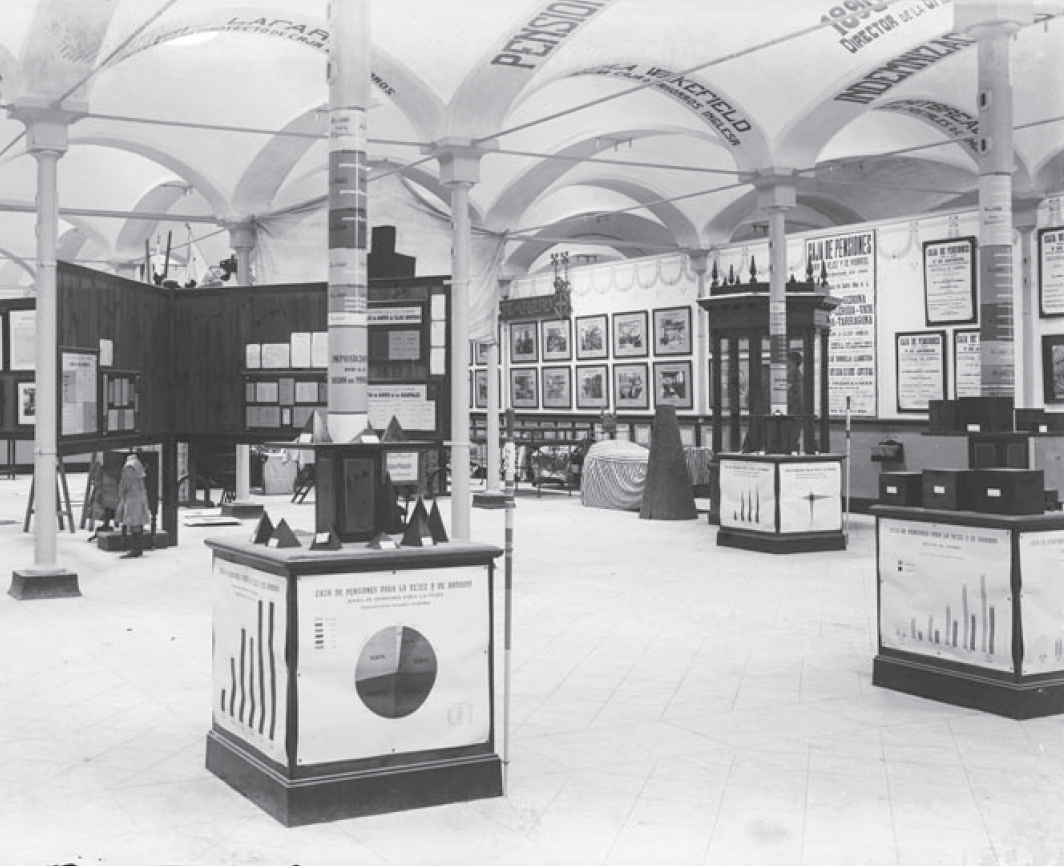
Can a museum be a tool for civic engagement? According to researcher Xavier Acarín Wieland, this was the idea behind the The Social Museum of Barcelona in Spain (1910–1920). This institute had an agenda: to bring a sense of collectivity around housing reforms and urban renewal projects through exhibitions. These exhibitions showcased large panels of infographics to illustrate the case, with 3D models and dynamic typography designed to inspire change. The public was invited in to share in the vision and the discussion of civic betterment.
The Social Museum of Barcelona, Spain (1910–1920)
The trajectory of Brazilian design
In a Brazilian Design Exhibition panel, Beatriz Futlik Mariani presented about how Brazil researched, cataloged and presented its craft history to raise up the artform and harness its potential for industry. Cyntia Santos Malaguti de Sousa spoke about The Brazilian Design Program (1995–2019) which had a goal to develop the Brazil brand when it comes to design and mark Brazil as a competitive player in globalization.
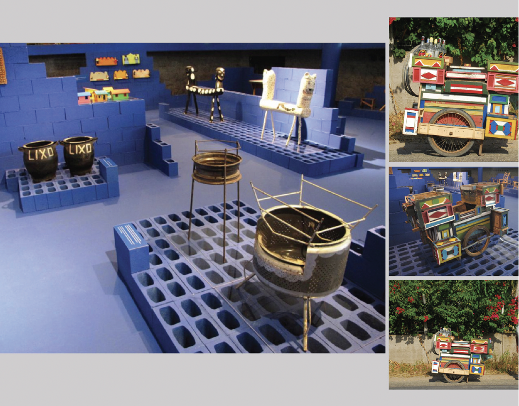
Coffee carts made in Bahia from recycled truck toys and wood, displayed in the ‘Design from the Periphery’ exhibit
2010 “Design from the Periphery” exhibition in Brazil. Slide by Mônica Moura
Mônica Moura rounded out the Brazilian panel highlighting the design of everyday utilitarian objects that celebrate the cultural heritage of Brazil. In 2010, an exhibit came together as a reaction against the international design aesthetic in favor of works of traditional craftsmanship. The “Design from the Periphery” exhibit showed off the ingenuity of everyday Brazilians who are designers, inventors, and craftspeople out of necessity. Elevating their work to the same plane as those renowned designers from the West, “Design from the Periphery” exhibited items such as kitchen utensils, coffee carts, and ovens often created from discarded materials.
The 1961 exhibit of the work of East German designer Klaus Wittkugel.
Cold War design from East Germany
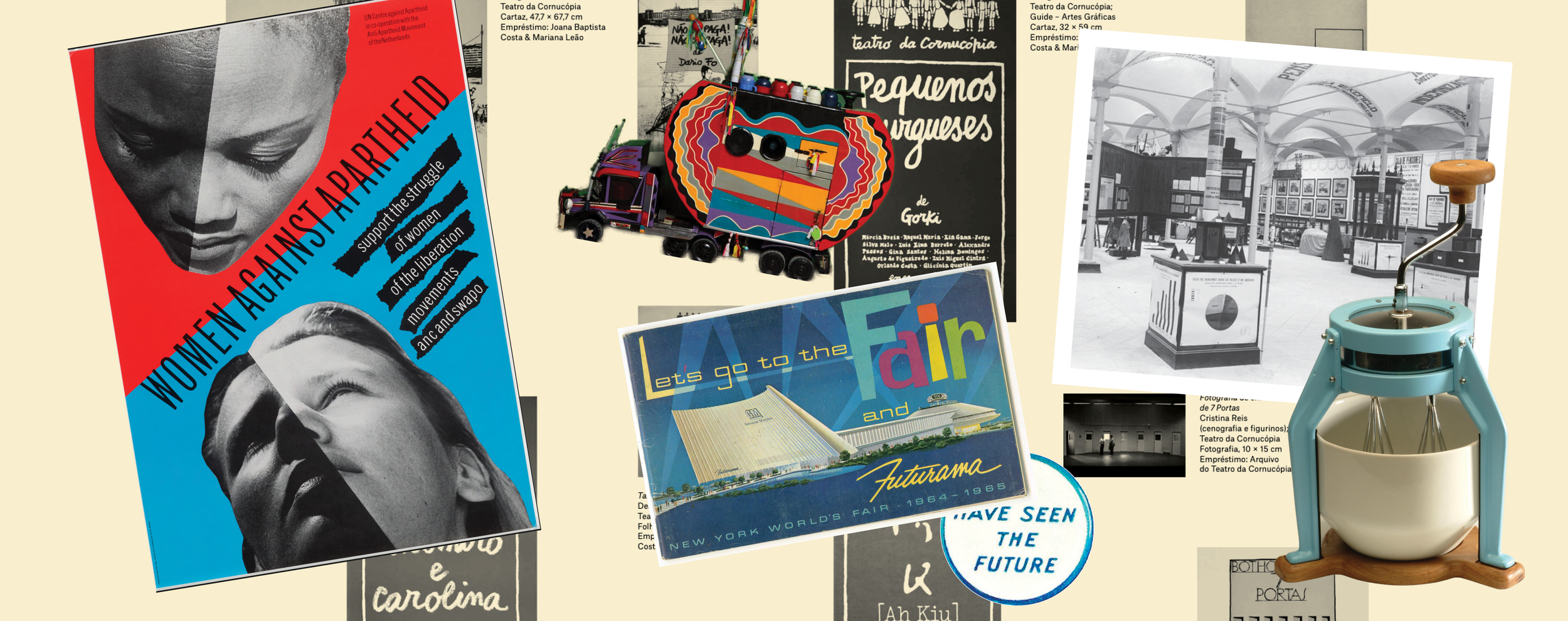
It is hard to think of a more politically tense time in modern history than the Cold War politics as they played out across East and West Germany. Thus, the premise of Jeremy Aynsley’s talk “Graphic Design Exhibitions in the German Democratic Republic of the 1950s and 60s” promised to be eye-opening. East Germany’s German Democratic Republic (GDR) knew design would be a key tool in gaining support for their new socialist state. The decreed art and design should avoid portraying “petty bourgeois individualism” which they saw as the signature of the West. Poster themes that were encouraged were ones that showcased family values, highlighted the worker, or promoted state-sponsored events. The 1961 exhibit of the work of East German designer Klaus Wittkugel showcased his anti-capitalistic views while still utilizing the visual language of modernism.
Diorama of the year 2014 from the 1964 New York City World’s Fair exhibit, Futurama.
Futurama
Envisioning a better future through capitalism was the theme of the 1964 New York City World’s Fair exhibit, Futurama. In a presentation by Monica Penick, we get a peek inside the pavilion put together by General Motors. Far from a car show, GM designers created an immersive experience kicked off by a Futurama Ride, where visitors could view the “world of tomorrow” from the comfort of their moving theater seats. Visitors glided through various dioramas depicting worlds only Buckminster Fuller could imagine: underwater, on the moon, in Antarctica, and the modern metropolis. These worlds feature wild, imagined technologies and promise utopic progress and prosperity. And of course you were reminded that these new frontiers or “dreams of the future” were brought to you by GM.
2. Forgotten histories upending the Western canon
Portuguese women of graphic design history
Errata: a Feminist Revision of Portuguese Graphic Design History
Isabel Duarte, in her “Beyond the Canon” talk, presents her exhibition “Errata: a Feminist Revision of Portuguese Graphic Design History” bringing to light 17 prominent-yet-forgotten women, and wrestles with a fundamental question: how could the work of these women be shown without merely becoming an appendix to the canon? Isabel proposes the need to break down mechanisms of oppression from the home to the publishing industry to institutions. She advocates breaking away from seeing only “signature” work as valuable, striking the designer hero and artifact-led narratives. These largely male design heroes of the past helped sell modern design to a corporate audience. But, by telling stories of individual grandeur, we miss the cultural influences and socio-economic circumstances in which these people practiced. Duarte’s talk reminds me of an AIGA Eye on Design article that eloquently states, “While we may not encourage historical understanding simply by adding more profiles to the canon, we do need to study ways of knowing and making from overlooked communities in the past. Graphic design history tells of a singular, professional, and closed field. But the future is pluralistic, shared, and open.”
Islamic bookmaking and calligraphic revival
Arabic book design from 1950s to the 1980s
The rich Islamic heritage of bookmaking and calligraphic traditions took center stage when Zeina Maasri showcased a jaw-dropping soon-to-be online exhibition of Arabic books. The digital exhibit will highlight books from the 1950s to the 1980s, a time when designers sought to revive work lost from the pre-colonial time, before the arrival of the letterpress and standardization. The exhibit is rich in cultural traditions, calligraphic styles, modern design collaborations and content that shows anti-colonial solidarity across borders.
“Displaying the Excluded: The Clash Between the Ulm’s Democratic Ideals and the Reality of the Admission Practices” by Maya Ober.
A study of rejected applications to design school
One of the most mic-dropping moments of the conference was “Displaying the Excluded: The Clash Between the Ulm’s Democratic Ideals and the Reality of the Admission Practices” by Maya Ober. Maya’s research began when she dove into the archives of the Ulm School of Design in Germany without a particular aim, instead abiding by the philosophy that “fieldwork is about losing control.” She knew she had something when she discovered that there were boxes of “rejected applications” that the archivist noted had never been requested to be seen by anyone before — they had simply been forgotten about. In a world where college admission practices and affirmative action are hot topics of conversation, Maya pored through these files from the post-war period reading applicant’s letters and the school’s responses. Maya collected demographic data and quantified the rejected applicants, but through the letters and follow up research, Maya also collected their stories. She broke down the university’s admissions hypocrisy with the precision of a skilled attorney and the empathy of a great storyteller. She interwove personal narratives giving voice to the dismissed.
Billboard designed by ACTUP to bring awareness to AIDS
Graphics from the street
Occasionally the panels organized under one theme were actually case studies in opposition. This was the case with the presentations by Portland’s own Michael Ellsworth and Raya Leary (based in Portugal) from Civilization who presented a few case studies of the evolution of graphic ephemera from a variety of social movements. They interrogated graphic design’s role in helping these movements reach their tipping point. From the insignia and newspapers of the Black Panther Party in Oakland that amplified the voices of everyday Black people, to the AIDS awareness transit campaign by ACTUP (the AIDS Coalition to Unleash Power) in Manhattan that used the language of modern advertising, these campaigns were effective by being bold, direct, sharp and undeniable.
Propaganda murals from Olinda, Brazil in 1982
In contrast, Amélia Paes, Silvio Barreto and Helena Barbosa’s paper titled, “Political Propaganda Murals in the City of Olinda in 1982: Communication Design and Shared Discourses in Urban Space” presented a study on how large scale murals in Olinda, Brazil became effective tools to convey a political message indirectly in an era of censorship and in the face of a military dictatorship. The murals reflected colorful landscapes, showcased themes of folklore, and honored the path to democracy. The murals were part of Brazilian Democratic Movement Party’s campaign to reinforce democratic ideas and instill pride in the local identity. The indirectness and complexity of the murals allowed for interpretation and was part of their effectiveness.
Rotterdam’s Boijmans Depot
3. Museums are figuring out how to “un-museum”
When no strategy is a strategy!
Weeks later I am still thinking of the paper, “The Curiosity Cabinet as a Post-Colonial Exhibition Design Practice” presented by Abbie Vickress and Sakis Kyratzis about Rotterdam’s Boijmans Depot museum which opened in 2021. Or maybe “un-museum” is a better descriptor for the space. The perfect response to Wild Plakken’s fear that the museum will kill the work, the Depot is a grandly designed glass storage warehouse for museum artifacts that are intended for more grandiose display. The exhibition design strategy at the Depot is that there is no strategy! All items collected are on display to the public through archive drawers, glass cabinets and other exhibit strategies that were designed into the architecture of the space. The building is first and foremost storage, and is organized by objects’ size and climate needs allowing for space optimization. All visitors by default are the curators, and digital interfaces invite to create your own digital exhibition, drawing new connections across geography and time. Whether aspects of this “un-museum” achieve their intentions of transparency, public access, and a post-colonial approach to exhibition design is a matter of debate. But, it is fair to say that this case study in extreme transparency will ripple throughout the art museum community for years to come.
We are living through a historic social moment of deconstruction and reconstruction. Design history teachers are faced with the challenge of how to break down the Western canon narrative and diversify voices in a way that is not white-centered, but also not simply an appendix. From Brazil’s “Design from the Periphery” exhibit, to the study of rejected applicants in Germany, and the un-museum strategies of the Netherland’s Depot, it was inspiring to see other design historians wrestle with these same issues, and share their research, conclusions, and best practices.
I was able to attend this conference thanks to a Portland State University Professional Development Grant. Thank you PSU!


